The most common way of presenting data is:
FREQUENCY DISTRIBUTIONS AND HISTOGRAMS
TERMINOLOGY
FREQUENCY: The number of data in a class.
RELATIVE FREQUENCY: The percentage of all data values that are in a class.
HISTOGRAM: The graphical presentation of (relative) frequencies
FREQUENCY DISTRIBUTION: CONSTRUCTION
- Divide the interval of available values into a series of subintervals (classes)
- Determine the number of data in each class
KEY POINTS IN CONSTRUCTING FREQUENCY DISTRIBUTIONS
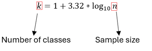
- Classes are used to give the correct picture of the distribution of the data (arbitrary definition, rule of thumb: 5-20 classes, usually more data -> more classes)
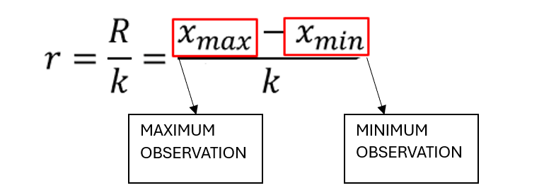
- Determine the range of each class (rule of thumb: classes of equal width usually)
- Determine the limits of the classes (measurements must be distributed in only 1 category)
Note: Grouping data leads to loss of information. The choice of the number and width of the classes leads to greater detail of the distribution.
Sturgess Type
Equal-sized classes r (The most common case)
The classes are calculated from intervals of the form: [ , ) or ( , ].
The classes must cover all the data.

Leave a comment