CONSTRUCTION OF FREQUENCY DISTRIBUTIONS – EXAMPLE: WEIGHT OF STUDENTS IN A FOURTH-GRADE
55, 51, 57, 63, 64, 55, 66, 70, 65, 62, 72.3, 51.5, 60.7, 52.3, 53.1, 54.7, 65.2, 62.7, 60.8, 55.2, 55.4, 57.7, 58.1, 60.4, 65.
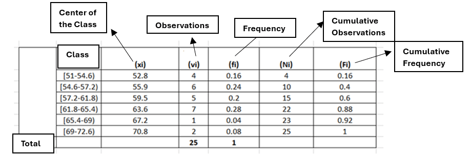
CLASS=6 (STURGESS TYPE=5.41022)
CLASS WIDTH=3.6
The graph of a grouped distribution is made with the Histogram.
FREQUENCY POLYGON
• How to present frequency distributions
FREQUENCY POLYGON: CONSTRUCTION
• We note the frequency of the class above its midpoint
• We join the consecutive points with straight lines.
• Virtual frequency classes of 0 are considered at each end of the distribution values to close the polygon
FREQUENCY POLYGON: USEFULNESS
• They give a general idea of the shape of the distribution.
FREQUENCY POLYGON: OBSERVATIONS
• In the same way, RELATIVE FREQUENCY POLYGONS are created (they allow a visual comparison of 2 distributions by placing one relative frequency polygon on top of another.

SUMMARIZED RELATIVE FREQUENCY POLYGON (OR SPIKE): A way of presenting frequency distributions.
SUMMARIZED RELATIVE FREQUENCY (ONE CLASS): It is the percentage of observations that are smaller than the upper limit of the class.
SUMMARIZED RELATIVE FREQUENCY (ONE CLASS): CALCULATION: It is the sum of the observations in this class and in all previous classes.
SUMMARIZED RELATIVE FREQUENCY POLYGON: CONSTRUCTION
• The cumulative relative frequency is marked above the upper limit of the class.
• Consecutive points are joined by straight lines.
SUMMARY RELATIVE FREQUENCY POLYGON: USEFULNESS
• The percentage of observations that fall below any value on the horizontal axis can be approximately determined.


Leave a comment