DOT DIAGRAMS
IT IS THE PLACEMENT OF THE AVAILABLE PRICES IN A LINEAR SECTION
* IT IS SUITABLE FOR A SMALL NUMBER OF OBSERVATIONS
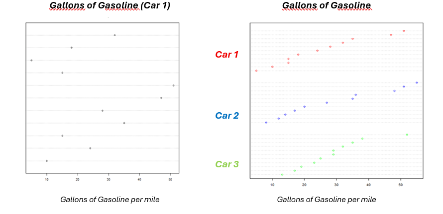
SOME OBSERVATIONS
• THE AVERAGE CONSUMPTION PER GALLON OF GASOLINE IS VERY CLOSE FOR THE 3 CARS
• THE VARIABILITY OF GASOLINE CONSUMPTION IN CAR 3 IS SMALLER
TOO MANY VALUES MAKE THESE GRAPHS WITH REDUCED SIMPLICITY AND INEFFICIENT
STEAM AND LEAF PLOTS
- Good way to describe the distribution of data.
- Good first step in constructing a frequency distribution or histogram.
PROCEDURE
• We divide each number into 2 parts (stem and leaf)
• We create a vertical line -> stem on the left, leaf on the right
EXAMPLE
# SCORE IN A TEST (MAXIMUM 100):
63,73,76,63,58,92,51,68,74,55,87,65,78,81,52
(STEM) | (LEAF)
5 | 1258
6 | 3358
7 | 3468
8 | 17
9 | 2
• The division into tens (stem) and units (leaf) is obvious – the division is not always obvious.
• What happens when we have thousands?
THESE DIAGRAMS GIVE A GOOD PICTURE AND A CONCISE PRESENTATION OF THE DATA
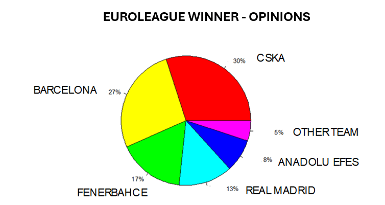
GRAPHICS FOR EXPRESSING QUALITATIVE DATA
EXAMPLE: We asked 300 basketball journalists, team officials, and former players which team will win next year’s EuroLeague. The table below shows their answers, followed by a pie chart.
| TEAM | # OPINIONS OF CONQUEST | % OPINIONS OF CONQUEST |
| CSKA | 90 | 30% |
| BARCELONA | 80 | 27% |
| FENERBAHCE | 50 | 17% |
| REAL MADRID | 40 | 13% |
| ANADOLU EFES | 25 | 8% |
| OTHER TEAM | 15 | 5% |
| TOTAL | 300 | 100% |
PIE CHART
A circle that is subdivided into circular sectors, each representing a category.
NOTES
o Area -> proportional to the % corresponding to the specific circular sector.
o Effective when the purpose is to clearly show the differences in the sizes of the categories.
o Often used to present economic figures.
Used for comparison at different times.
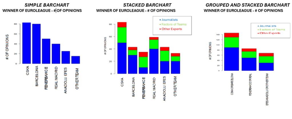
BAR CHART
A graph that is represented by rectangular bars, each representing a category.
NOTES
o Height or width of bar -> Proportion of the % corresponding to the specific category.
For more complex comparisons, alternative forms of (grouped, stacked) are used
STACKED BARCHART
If we have to capture new information.
HERE -> OPINIONS BY CATEGORY OF RESPONDENTS (for each group)
GROUPED AND STACKED BARCHART
If we have to capture new information. HERE -> OPINIONS BY CATEGORY OF RESPONDENTS (for each group)

Leave a comment